It depends February 12, 2013
For the last months this debate has occupied many posts, news, questions and generated different reactions. Designers ditching skeuomorphism and praising flat design, or arguing whether you should go for one against the other. It seems that the debate is just focusing on the visual or aesthetics of design, but both are different ways to tackle design problems, so...why do you have to choose?.
Not only a visual design debate
It seems everything on this subject revolves around aesthetics (textures vs no textures, dropshadowed gradient color buttons vs flat ones etc..) however if we scratch deeper on the subject we will find out that it´s not about choosing a visual style, it´s about making design choices.

Skeumorphism (when done right) has the advantage of the affordances. Someone unfamiliar with digital calendars will quickly recognize one that´s made out of paper texture and has the dates set just as a wall calendar would. The reason is that it replicates the user mental model of what a calendar looks like. Therefore that user will feel more comfortable when they use it.
So, claiming that using realistic or skeoumorphic design is wrong is really incorrect. What people criticise about it, is the visual overuse of textures, gradients, bevels and lights.
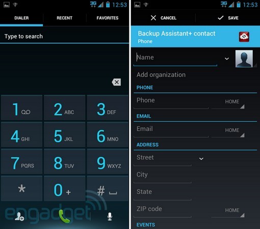
Flat design on the other hand takes everything to the minimal and praises the "form follows function" ideal. What people claim about it is that it´s just native to digital products: "A beveled button is a lie" people say, because we can´t touch the bevelness on a realistic designed button, we just touch flat glass. However we can pinch and zoom, tap and slide etc... Therefore, true "flat design" focuses on where we stand today, a digital realm where new interactions should be defined.
A good example of a product that defines these new digital-only interactions would be Figure by propellerhead. It´s simple to use and provides many touch gestures not available in realistic music tools.
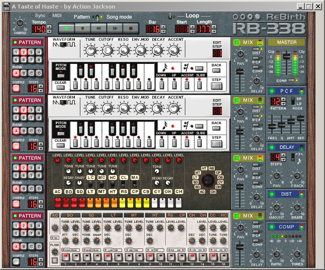
It´s funny that they also produced the over-realistic Rebirth 338, I spent hours making music with that program some years ago, you had to twist all those knobs and dials with the mouse pointer..

Not too long ago, skeuomorphism was how we presented digital tools, but we were constrained by its mimic of real world objects with their limitations. Nowadays, flat design opens new realms of interaction and that´s why we designers are all excited about it. However we have to be very careful no to get too excited and start diminishing the UX just because we want the design to "look" simpler. that´s a mistake.

Ask yourself it if solves the problem
So in the end, it really comes down to a simple question: Does it solve the problem? and by solving the problem I mean if it´ll help people understand and interact with your creations. If your target audience is people that need the security and affordances of skeuomorphism, then go for it. It just works great like that.
Embrace flat design if you are sure that it will benefit the experience of your product, test it and reduce redundancies to the limit, find new interactions and explore because we are still in the early days of digital design.