A puff of colour.
What if you need to buy a new kettle, but it has to be red to match your kitchen?
That difficult quest is what inspired create Colourpuff.com. I helped make it real, working on digital strategy, information architecture, user experience and visual layout.
What is colourpuff?
It’s a website dedicated to the only purpose of helping you find household items, pieces of decoration or even vacuums based only on colour. It works with brands such as John Lewis, Made, House of Fraser, Debenhams or M&S.
My role
A project oriented jack of all trades taking care of the brand design, information architecture, user flow and visual layouts.
Designing the experience
How would you make it easy for people to find an object based only in colour?.
I considered that a search experience like this should first need some boundaries.
According to studies, there are millions of colours to the human eye.
Also, there are many different shades of a colour, grey to name one. And also black and white do not appear on a rainbow as colours.
But I considered that when you are looking for a product, you basically use a common set such as the rainbow. It’s the natural language: A red lamp, a green spoon or a yellow submarine.
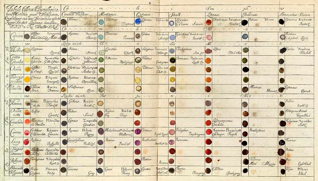
I did a bit of research and found several ways to delimit and catalog colour. The most amazing was the Richard Waller’s “Tabula Colorum Physiologica” created in 1688.
Finding a solution
The interface should definitely make sure it was easy to choose a colour matched with a room. In the home screen, users would interact with a colour wheel or picker that would delimited the colour choice and then some sort of dropdown for the room choice. It would also need to give some feedback as in "I chose green for the living room".
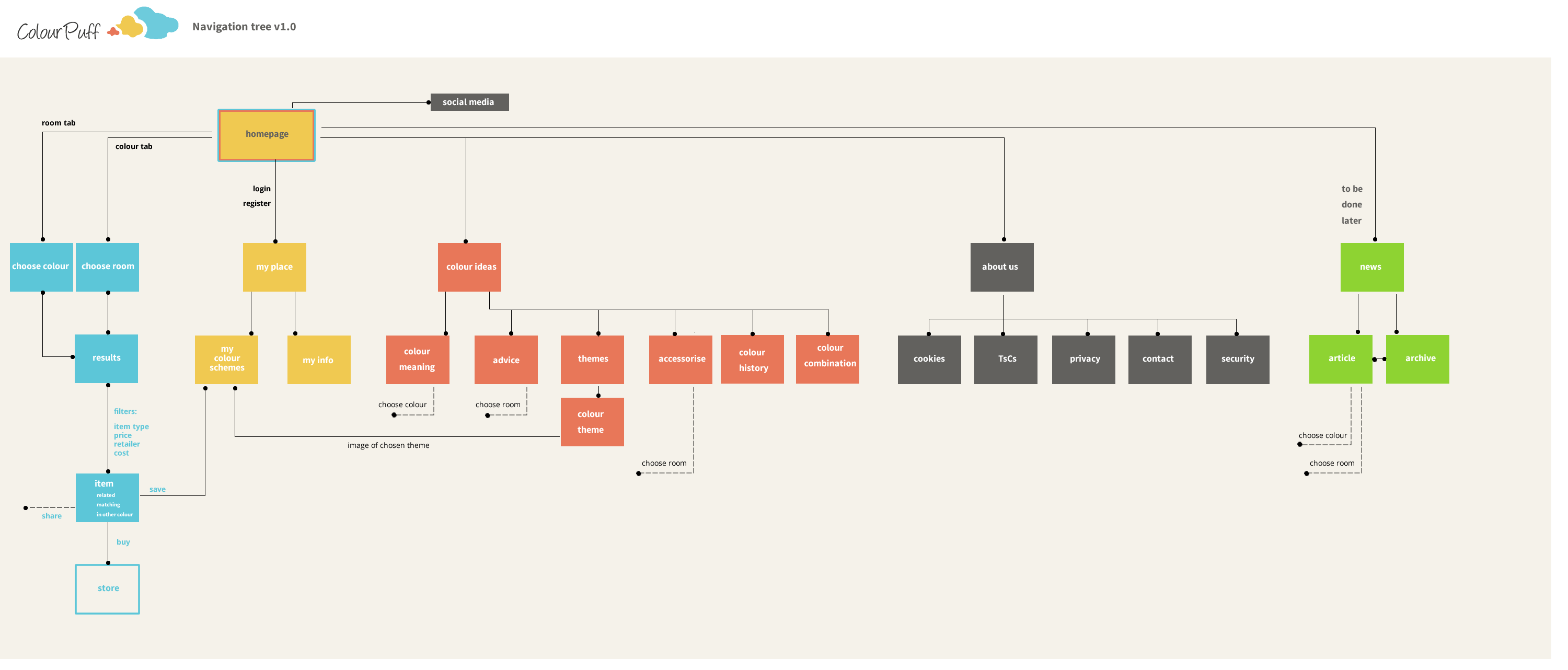
While thinking on this home screen solution, I also delimited the architecture and user flow for the website, focusing on what made sense for users and what colourpuff would provide. Nothing too complex either:
In order to make some sense, I decided to delimit the colour choice at the homepage with something like this:

But I considered that when you are looking for a colour product on a store, you don’t ask for such a detailed range, you don’t need to be so granular. So going back to natural language, it was decided to use a “darker” and “lighter”choice.
A basic colour wheel based on a rainbow such as this one would make it easy, and with a dark and lighter shade it would fit. It could even be made into a puff also, why not? And then add a small one for black, white and grey. This idea helped delimit to set to a particular colour for an object.
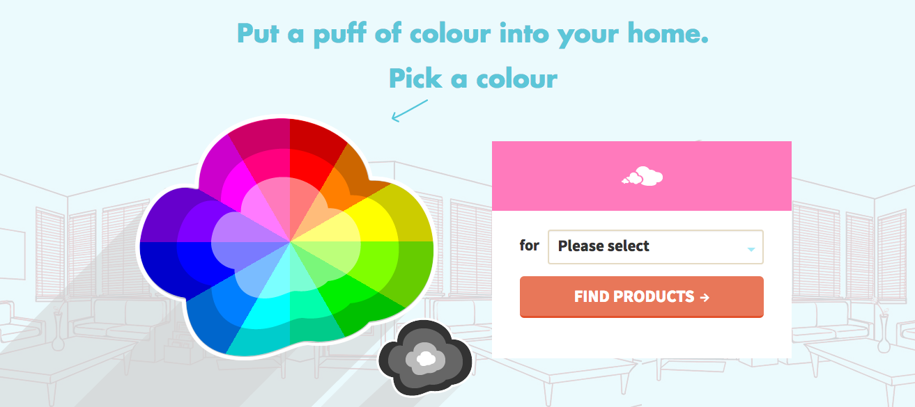
The chosen colour then would inform a module consisting of a dropdown with the room choice and a button.
You would then go into SERP and filter products, create your colour choices etc…
The result
The wheel was tested with users on desktops and phones. And it worked seamlessly.
So far the colour wheel puff seems to be working well and provides an easy to use interaction. The further work done on SERP and colour definition also allows in-store help recognition.
As mentioned previously, I also designed all the experience, layouts and sections so hope you get a chance to experience colourpuff.com
Did you know you can buy a Zoeppritz fleece throw blanket in aubergine?